
In the evolving landscape of web development, Bootstrap has emerged as a critical
framework for front-end developers. Its ability to streamline responsive design and simplify
the process of building modern, aesthetically pleasing web pages has made it an essential
tool for many developers. As a result, understanding Bootstrap and being able to answer
related interview questions proficiently is crucial for any aspiring web developer. Below, we
have compiled a detailed list of Bootstrap interview questions that can help you prepare
thoroughly and make a strong impression.
What is Bootstrap, and Why is it Used?
Bootstrap is a free, open-source framework directed at simplifying the process of creating
web pages. It includes HTML, CSS, and JavaScript components for creating forms, buttons,
navigation, and other interface elements. The primary purpose of Bootstrap is to allow
developers to build responsive, mobile-first websites quickly and efficiently.
• Responsiveness: Bootstrap is designed with a mobile-first approach, making it
easier to create responsive websites that work seamlessly across various devices.
• Consistency: It ensures consistency in design and layout across different browsers
and devices.
• Customizable: Bootstrap is highly customizable, allowing developers to tailor the
framework to their specific needs.
• Community Support: Being one of the most popular frameworks, Bootstrap has
extensive community support, making it easier to find solutions and resources.
Explain the Grid System in Bootstrap.
The Bootstrap grid system is a powerful tool that allows developers to create flexible and
responsive layouts. It is based on a 12-column layout, and each row in Bootstrap can
accommodate up to 12 columns.
Key Points About Bootstrap's Grid System:
• Flexibility: Columns can be combined to create wider columns. For example,
combining three col-4 classes will take up the entire row.
• Responsive: The grid system is responsive, automatically adjusting the layout
based on the screen size (e.g., col-sm-, col-md-, col-lg-).
• Nesting: Columns can be nested within other columns to create more complex
layouts.
• Offsets: Columns can be offset to create space around them.
What Are Bootstrap Containers?
Containers are the most basic layout element in Bootstrap and are required when using
the grid system. They wrap the site content and center it within the browser viewport.
Types of Containers:
1. .container: Provides a responsive fixed-width container.
2. .container-fluid: Provides a full-width container, spanning the entire width of
the viewport.
3. .container-{breakpoint}: Provides a container that’s 100% wide until a
particular breakpoint is reached, such as .container-sm.
Explain the Use of Media Queries in Bootstrap.
Media queries in Bootstrap are a crucial part of creating responsive designs. They allow
the application of CSS rules based on the properties of the device being used, such as its
width, height, or resolution.
Commonly Used Breakpoints:
• Extra Small Devices: <576px - No media query needed as this is the default.
• Small Devices: ≥576px - .col-sm-
• Medium Devices: ≥768px - .col-md-
• Large Devices: ≥992px - .col-lg-
• Extra Large Devices: ≥1200px - .col-xl-
• XXL Devices: ≥1400px - .col-xxl-
By using these breakpoints, developers can create layouts that adapt to various screen
sizes, enhancing the user experience.
What is a Jumbotron in Bootstrap?
A Jumbotron is a Bootstrap component used to showcase key content on a webpage. It
typically features a large heading, text, and a call to action. This component is often used
as a hero unit to grab user attention.
Explain Bootstrap's Button Classes.
Buttons are an essential part of web forms and user interactions. Bootstrap provides a
variety of classes to style buttons.
Common Button Classes:
• .btn-primary: Creates a primary button, usually blue by default.
• .btn-secondary: Creates a secondary button, often grey.
• .btn-success: Green button indicating success or positive action.
• .btn-danger: Red button for dangerous or negative actions.
• .btn-warning: Yellow button for warning messages.
• .btn-info: Light blue button, often used for informational messages.
• .btn-light and .btn-dark: Buttons with light or dark themes.
Button Sizes:
• .btn-lg: Creates a large button.
• .btn-sm: Creates a small button.
• .btn-block: Creates a block-level button that spans the full width of its parent
container.
What is the Use of Bootstrap Cards?
Bootstrap Cards are a versatile component that can be used to create a wide variety of
layouts and interfaces. A card is a flexible and extensible content container with multiple
variants and options.
Card Features:
• Header and Footer: Cards can include headers and footers to segment content.
• Images: Cards can display images at the top, bottom, or as a background.
• Content: Cards can hold various types of content like text, links, buttons, etc.
• Flexibility: Cards can be used to create carousels, grids, and more complex
structures.
How to Use Modals in Bootstrap?
Modals are a widely used component in Bootstrap for creating dialog boxes, popups, and
alerts. They are an essential part of creating interactive web pages.
Important Attributes:
• data-toggle="modal": Indicates that the button will toggle the modal display.
• data-target="#exampleModal": Links the button to the specific modal by ID.
• tabindex="-1": Ensures the modal is not accessible by tabbing when not open.
• aria-hidden="true": Hides the modal from screen readers when it’s not open.
How to Implement Bootstrap's Responsive Utilities?
Responsive utilities in Bootstrap help control the visibility of content based on screen size.
These utilities are essential for creating layouts that adapt to different devices.
Common Responsive Utilities:
• .d-none: Hides an element across all screen sizes.
• .d-{sm, md, lg, xl}-none: Hides an element on specific screen sizes.
• .d-block: Displays an element as a block.
• .d-inline-block: Displays an element as an inline block.
• .d-flex: Applies display: flex to an element for creating flexible box layouts.
Conclusion
Bootstrap continues to be an indispensable framework for web developers, providing a
robust set of tools to create responsive, consistent, and aesthetically pleasing websites.
Mastering Bootstrap and understanding how to implement its features can significantly
enhance your web development skills and make you a valuable asset in any development
team.
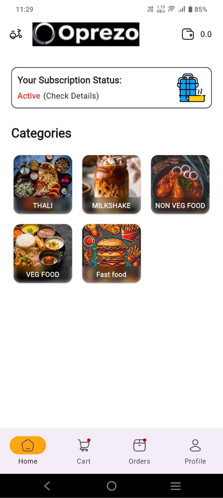 Pre-Built E-Commerce App Solutions by Oprezo India: A Complete Package with Single Vendor App, Delivery Boy App, and Admin Panel
 The Journey of Karanveer Mehra: Bigg Boss 18 Winner
 Web Development Services in Delhi /NCR
 Mobile App Development in Delhi /NCR
 Mobile App Development Services Agency in Delhi: Oprezo India