Responsive Design vs. Mobile-First Design: What's the Difference?
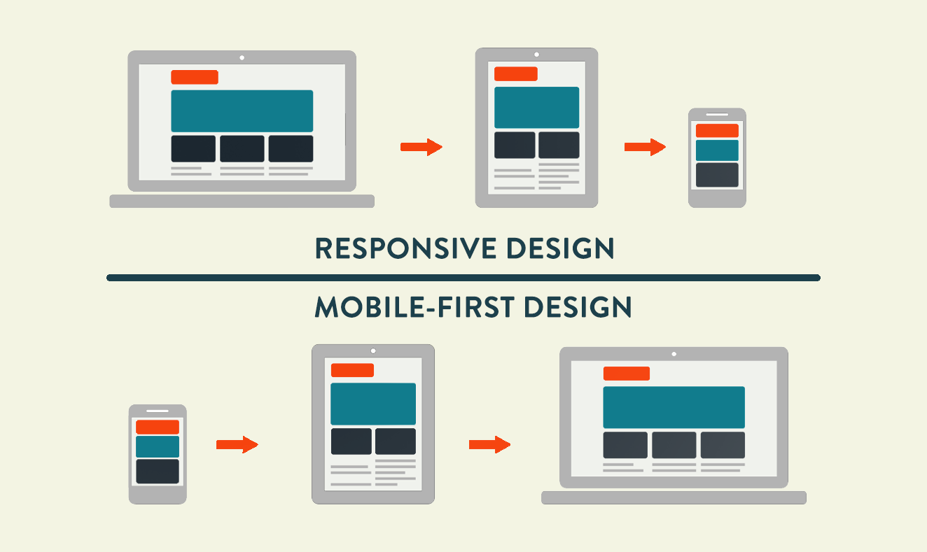
In today's digital landscape, ensuring a seamless user experience across various devices and screen sizes is crucial. Two popular approaches to achieving this are Responsive Design and Mobile-First Design. While they share similarities, they differ in approach and philosophy.
Responsive Design
Responsive Design is an approach that focuses on creating a flexible and adaptable layout that adjusts to different screen sizes and devices. The design responds to the user's device, orientation, and screen size, ensuring a consistent experience.
Key characteristics:
- Fluid grids and layouts
- Flexible images and media
- Media queries for different breakpoints
- Content rearrangement for smaller screens
Mobile-First Design
Mobile-First Design, also known as Progressive Enhancement, prioritizes designing for smaller screens first and then gradually enhancing the design for larger screens.
Key characteristics:
- Designing for small screens (mobile) first
- Prioritizing essential content and features
- Gradual enhancement for larger screens
- Focus on simplicity and minimalism
Key differences:
1. Approach: Responsive Design focuses on adapting to different screen sizes, while Mobile-First Design prioritizes designing for smaller screens first.
2. Design philosophy: Responsive Design aims for consistency across devices, whereas Mobile-First Design emphasizes simplicity and essentiality.
3. Content prioritization: Mobile-First Design forces designers to prioritize content and features, whereas Responsive Design may lead to cluttered designs on smaller screens.
When to use each:
1. Responsive Design: Suitable for:
- Existing websites needing a redesign
- Complex, content-heavy websites
- Websites with diverse user demographics
2. Mobile-First Design: Suitable for:
- New projects or startups
- Simple, focused applications
- Websites with primary mobile usage
Best practices:
1. Use a combination of both approaches
2. Prioritize content and simplicity
3. Test extensively across devices and screen sizes
4. Consider user experience and behavior
Conclusion:
Responsive Design and Mobile-First Design are complementary approaches that ensure a seamless user experience across devices. Understanding the differences and similarities between these approaches will help designers and developers create effective, user-friendly digital products.
 Best Mobile App Development Company in Delhi NCR | Oprezo India
 Top Web Development Services in Delhi/NCR | Oprezo India – React JS, Angular JS, eCommerce & More
 Top Mobile App Development Company in Delhi / NCR | Oprezo India
 Mobile App Development in Delhi - Android, iOS, Hybrid & Flutter | Oprezo India
 Why Oprezo India is the Best Web Development Partner in Delhi NCR?